MagIC Help Library |
|||
MagIC Help Library |
|||
2.2.4 Plotting and Visualizations
Many Plotting and Visualization options are available through the Plot menu. In the plots and maps that you can generate at the MagIC Website all data from a single results table are included. If a results page contains more than one table, you can always Group Together the tables and make a new plot with all combined data. All plots can be saved as PNG (image) or SVG (scalable vector graphics).
These plotting tools will be expanded considerably in the future, allowing different kinds of experiments and data to be plotted, such as Rock Magnetic measurement plots (hysteresis loops, FORC diagrams, etc) and Stratigraphic Section and Drill Core plots. The ultimate goal is to make these plots and maps of good publication quality, to deliver them as SVG (already available), and to make the plotting more interactive so that you can access the results of different averaging scheme's or data selections.
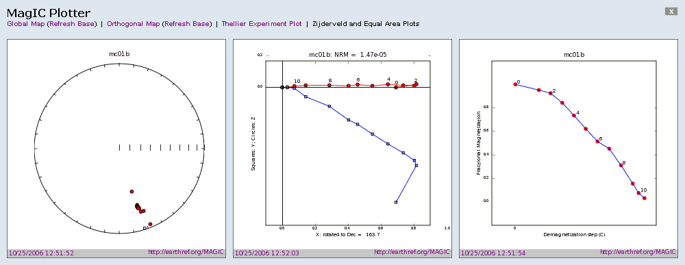
Global Maps and Orthographic Projections
On the Location, Site, Sample, Specimen and Measurement levels you can generate maps that plot their latitude-longitude positions. Global Maps (see the image above) are available as well as Orthographic Projections (below) in order to view data around the poles. Both map views are combined with an Equal Area plot.


On the Measurement level you can plot various other diagrams, such as typical Zijderveld, Thellier and Arai plots. These plots (see below and next page for some examples) are drawn from the data residing in the database and provide a good view of the data itself and the quality of the experiments carried out.

See also ...
Contents MagIC Chapter 2 MagIC Website Topic 2.2.1 MagIC Website Home Page Topic 2.2.2 The PMAG Portal