MagIC Help Library |
|||
MagIC Help Library |
|||
4.3.4 Utilities Menu
When you pull down the "Utilities" menu, you will see these options:
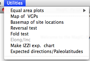
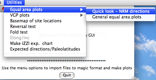
Choosing the "Quick look" option will cause the program to search through the magic_measurements.txt file in your project MagIC directory. The MagIC.py GUI will look into a file called coordinates.txt which is created when you import an orientation file. If you haven't you will only be able to look at the data in specimen coordinates. If you have, you will be asked to specify which coordinate system you desire. Click on the one you want, then on the 'OK' button. You will then see a plot something like this:
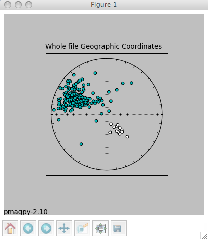
The title will specify the coordinate systems. As usual, solid symbols are lower hemisphere projections. In the terminal window, you will see a list of all the specimens that were plotted along with the "method of orientation (SO-) and the declination and inclination found. You can save the plot in the default format (svg) or in some other supported format (e.g., jpg, gif, png, eps) by clicking on the save (the little diskette icon) button on the plot. The default file format can be imported into for example Adobe Illustrator and edited.
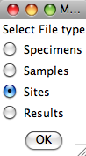
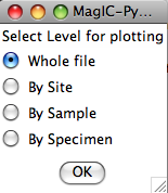
Choosing the general option allows more possibilities, depending on what you have done. You must have selected Assemble Specimens to plot specimen directions or great circles. To plot data for sample or site means, you must first Assemble results. Assuming you have done both, you will be presented with a window that looks something like this:
Choose the level you desire by clicking on it, then click on the "OK" button. Next, you must choose which level you want to plot. Be aware that you could choose to plot at the specimen level yet have chosen to look at the site table which has no specimen level data. In that case you would get a message that there were no data to plot. Here we choose to plot the whole file:
Now you can choose what sort of confidence ellipse you want to plot. Fisher statistics, including how to combined lines and planes are explained in Chapter 11 of Tauxe et al., 2009 and the other methods are explained in Chapter 12. Select the method of choice (or None) and click on the "OK" button.
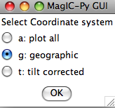
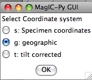
Finally, select your desired coordinate system. You will be presented with a list of options based on what you imported as orientation information. However, if, for example, when you prepared the results file you choose only the geographic coordinate system and not the tilt corrected one, choosing the tilt corrected coordinate system here will result in no data to plot. Here we chose the geographic coordinate system and were presented with this plot:
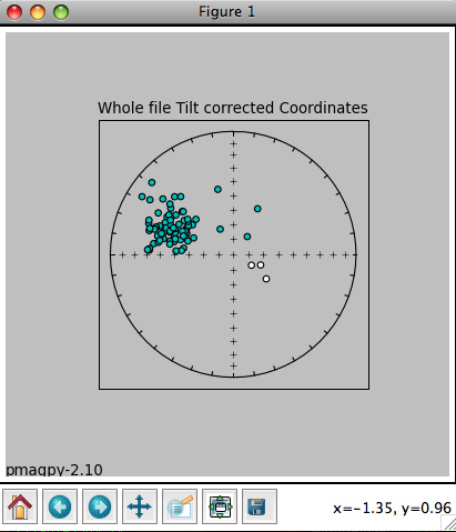
The title reflects the choices that were made. The plot can be saved using the save button or on the command line. In the terminal window you will see a list of the data that were plotted, and the associated method codes. When the eqarea_magic.py program is finished, control will be returned to the MagIC.py
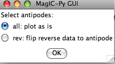
If you choose a coordinate system that is not in the pmag_results.txt file (either because there were no orientation data imported or you did not choose to include it when you assemble the results table), you will have no data to plot. Then you will be asked if you want to flip reverse data to their antipodes. In fact, this option takes all negative latitudes as reverse, so you should be careful with data sets from the Paleozoic or PreCambrian:
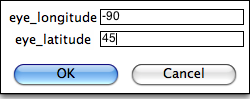
You can customize the projection by setting the position of the "eye". The default is a polar projection.
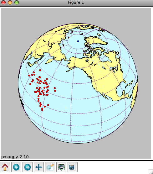
You will get a plot something like this:
The green square is the spin axis. If you elected to flip 'reverse' data, they will be plotted as green triangles. The plot can be saved in the default format (svg) by typing 'a' on the command line followed by a return (enter) key. For other formats, use the save button on the plot window.
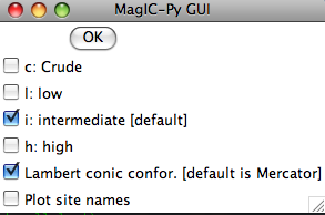
Depending on your choices, you may get a plot like this:
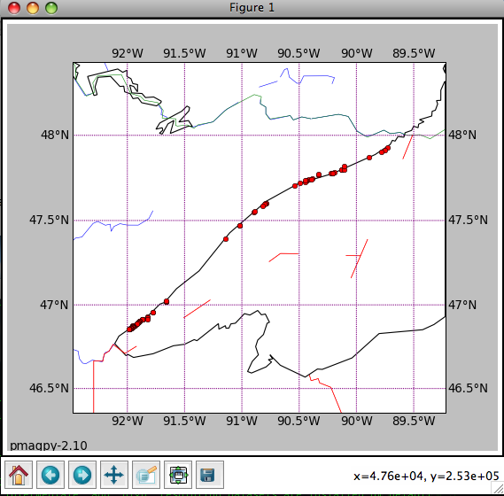
Save the plot by typing 'a' on the command line followed by a return (enter) key, or using the save file button on the plot window itself.
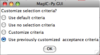
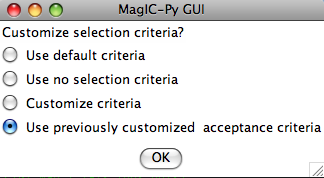
Then it will ask about selection criteria:
And finally, it will give a plot similar to this:
The program takes your data and breaks it into two modes: normal and reverse. It flips the directions in the second mode (usually the reverse one) to their antipodes. Then the program computes the mean direction for each mode and computes the X, Y and Z components for these means directions. Then it re-samples the dataset randomly (a bootstrap pseudo-sample with replacement), generating a new data set which it breaks into two modes, and calculates the components of the mean directions of these. This it repeats 500 times, collecting the components of the two modes. When the bootstrap is finished, the three components of the two modes are sorted and plotted as cumulative distributions in the three plots with the two colors (red for the first mode and blue for the second). The bounds containing 95% of the values get plotted as vertical lines for the two modes. A negative reversals test is achieved when the bounds for the two modes for any of the three components exclude each other.
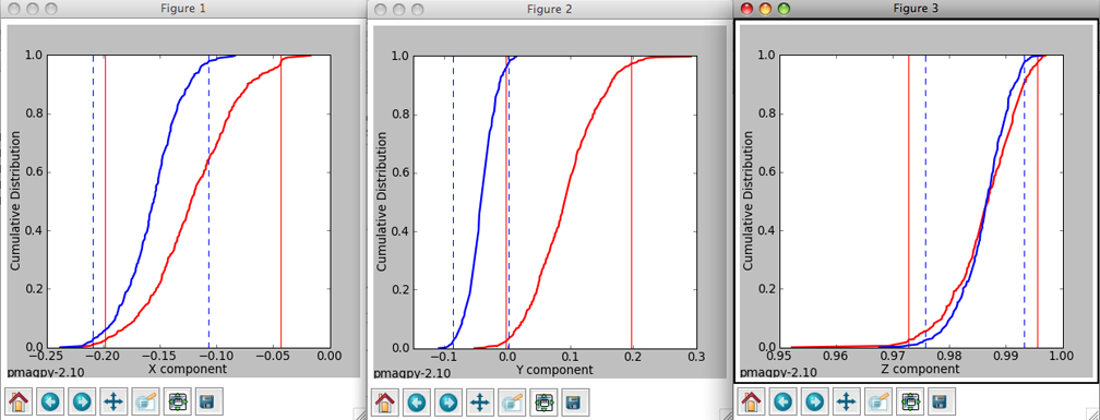
Then the program will generate plots like these:
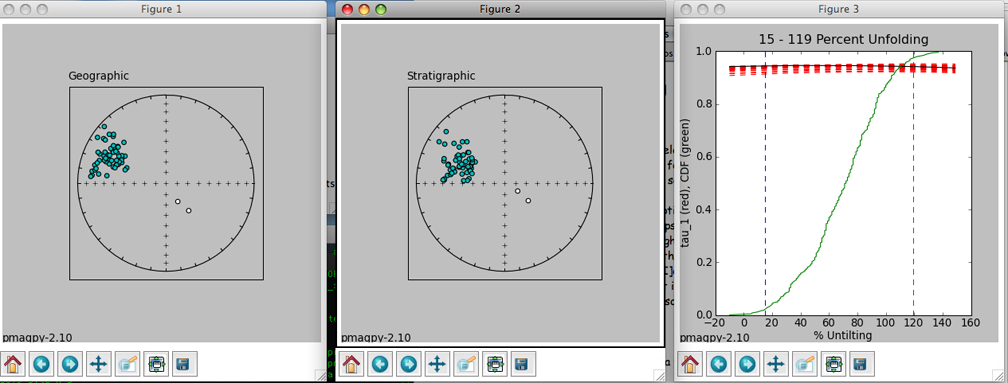
The left hand plot is of the data in geographic coordinates, the middle is after 100% tilt correction and the right hand plot is a cumulative distribution plot of the maximum eigenvalues obtained through principal component analysis of bootstrapped data after various percentages of untilting. This is a measure of concentration that does not require sorting data out by polarity. The vertical bars are the limits bounding 95% of the data. This particular result is not very impressive allowing peaks in concentration spanning virtually the whole range. The dashed red lines represent the behavior of 20 (out of 1000) bootstrapped data sets.
See also ...
Contents MagIC Chapter 4 Importing Data With PmagPy and MagIC.py Topic 4.3.1 File Menu Topic 4.3.2 Import Menu Topic 4.3.3 Data Reduction Menu